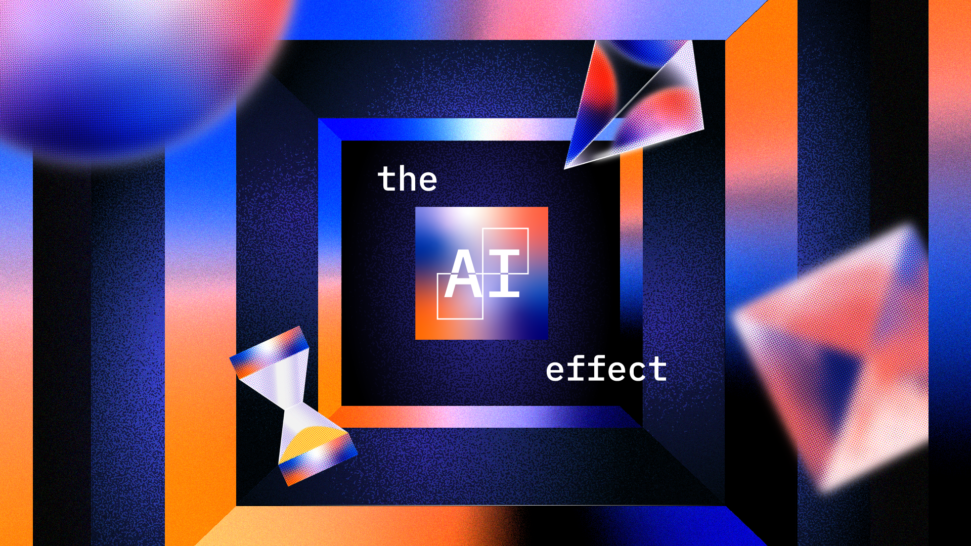
WIRED & IBM’s
The AI Effect
I worked on a four-part video series for IBM and WIRED that explores the role of AI across different industries. The series is featured on WIRED UK’s YouTube channel and is accompanied by in-depth articles on the WIRED website. For this project, I created the styleframes, storyboards, and illustrations for the articles. Here I showcase my work for episodes 1 and 2.
Putting the human back into AI
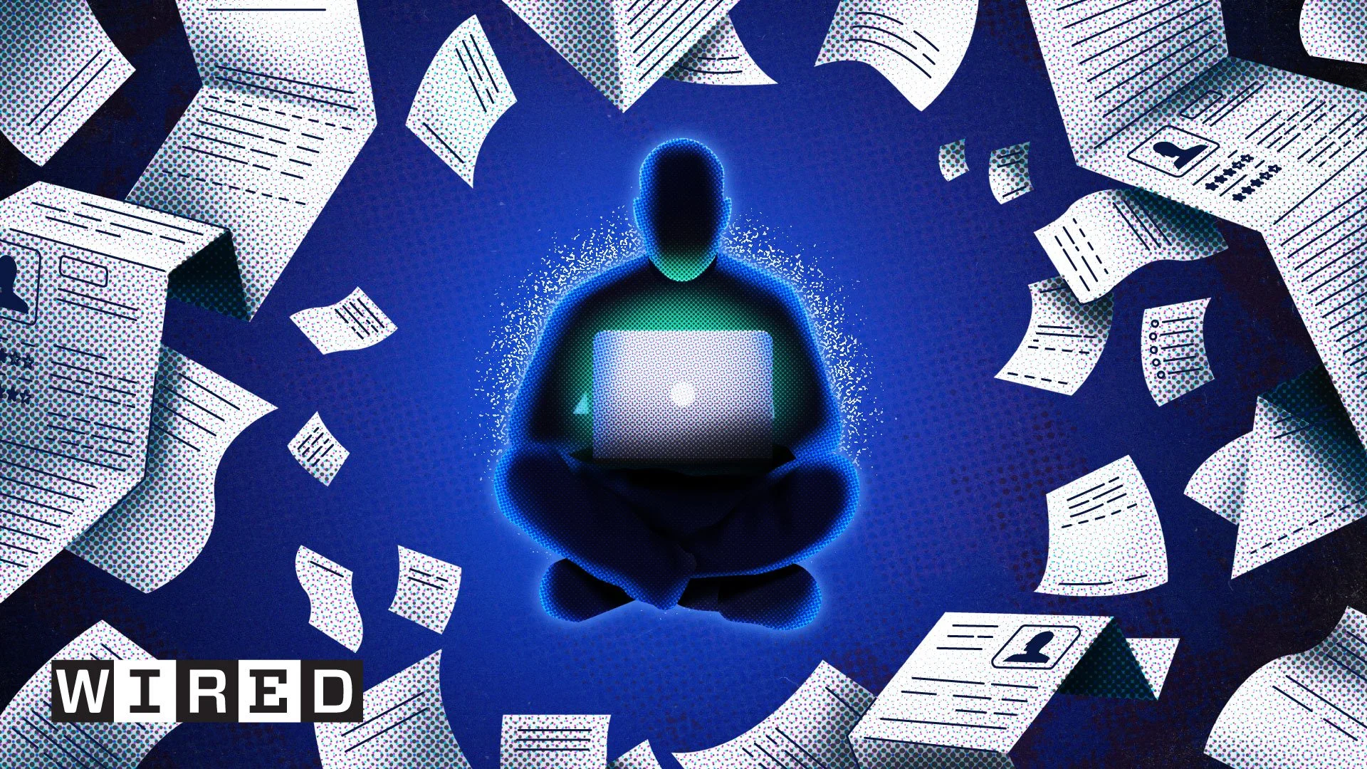
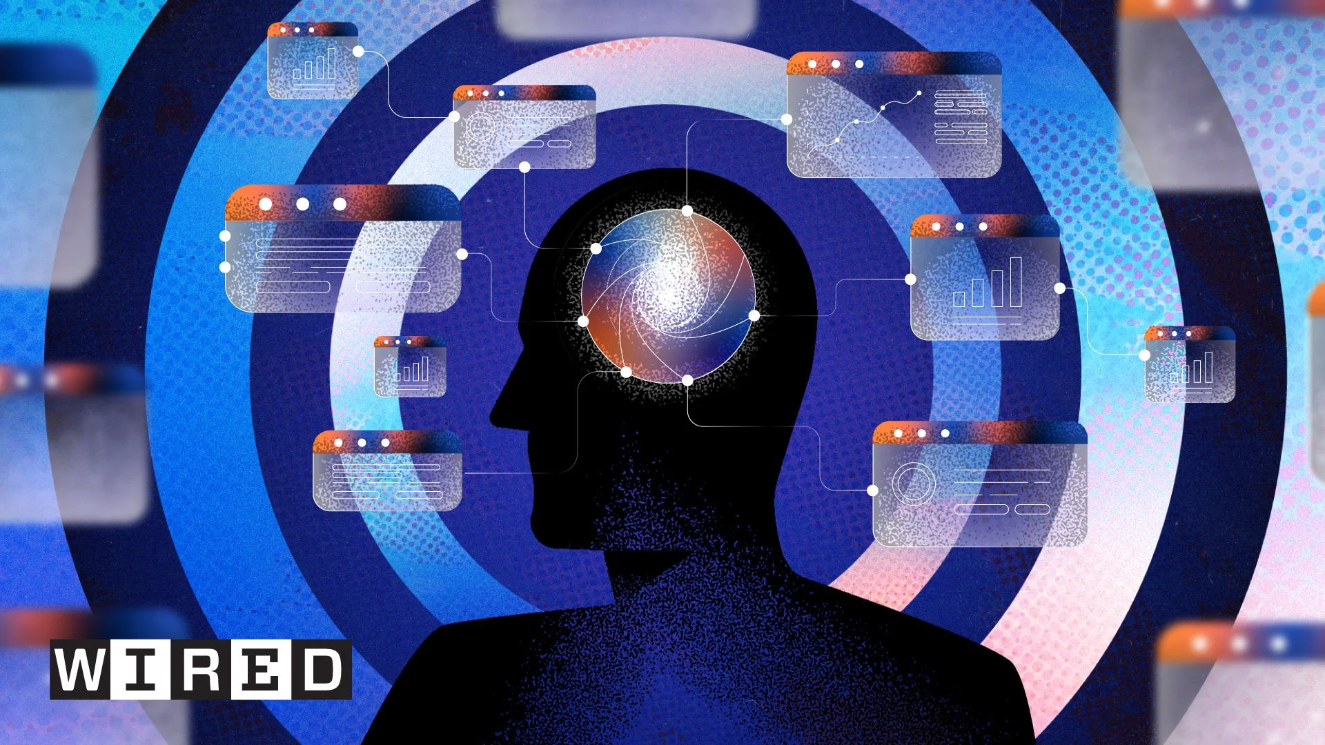
Below is a selection of the work I created for the first episode, which focuses on AI in HR. We aimed to find a visual style that matched the abstract nature of AI within human resources. This led to the concept of a ball that represents the AI and guides the employee throughout their career.
The two illustrations below are featured in the article that accompanies this episode. A link to the article can be found below. In addition, the episode itself, along with the styleframes and a selection of storyboard snippets created for this project.
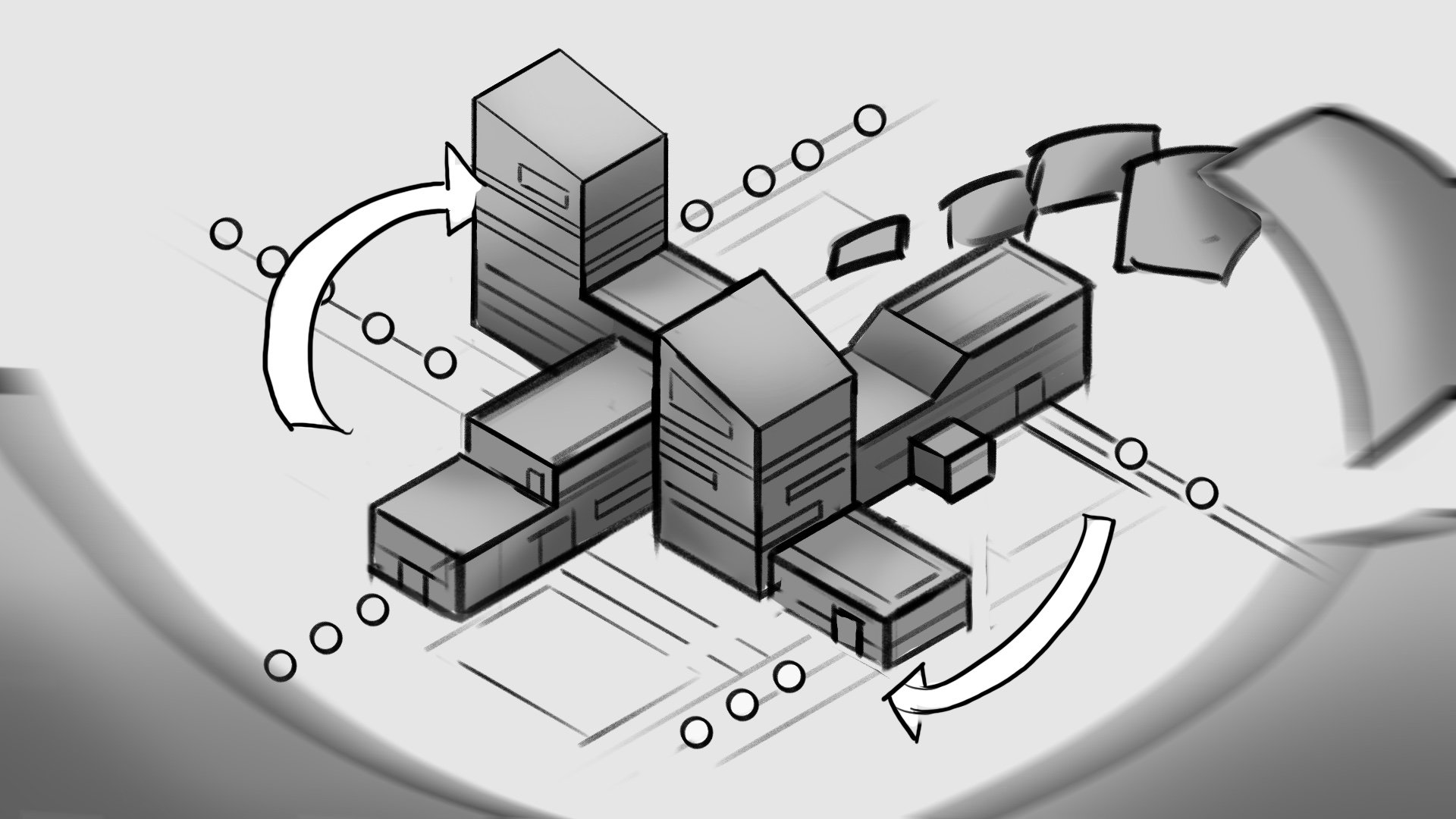
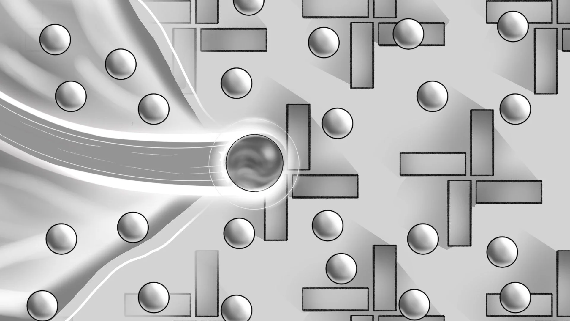
Styleframes
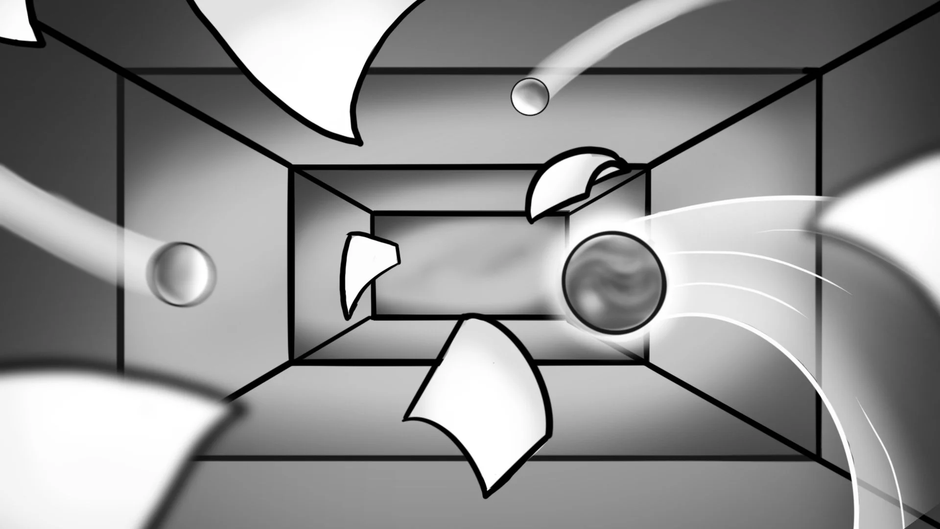
The idea was to build an abstract world that could communicate how AI supports people in HR by enhancing decision making and simplifying complex tasks. Telling a human story within an abstract space is challenging, especially when avoiding literal representations of people and technology.
To solve this, we reduced everything to a single visual language. People and AI are both represented as spheres. The monochrome spheres symbolise human presence within the HR system, while the vibrant gradient sphere represents AI as an enabling force that introduces nuance, flexibility and momentum.
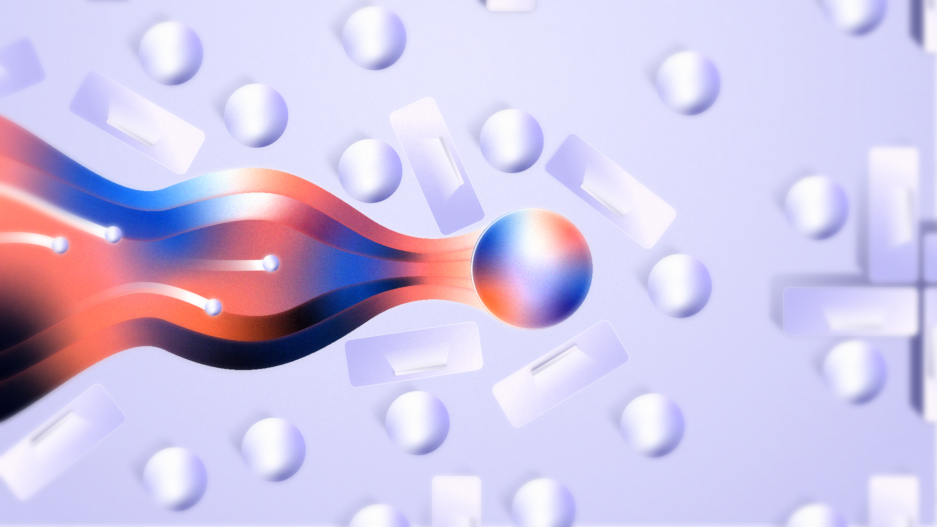
Conceptually, the world before AI is rigid, muted and uniform. As AI is introduced, the environment gradually shifts toward a more organic and expressive visual language. Structure becomes fluid, colour emerges, and the system feels more adaptive and human-centred. This contrast between the existing state and a possible future was essential in making the impact of AI tangible without relying on literal metaphors.
The visual style continued to evolve throughout the process. Some early styleframes differ from the final output, reflecting how the direction shifted during the proces. I chose to include both the initial explorations and the final result to show not only where the project landed, but how the visual thinking developed along the way.

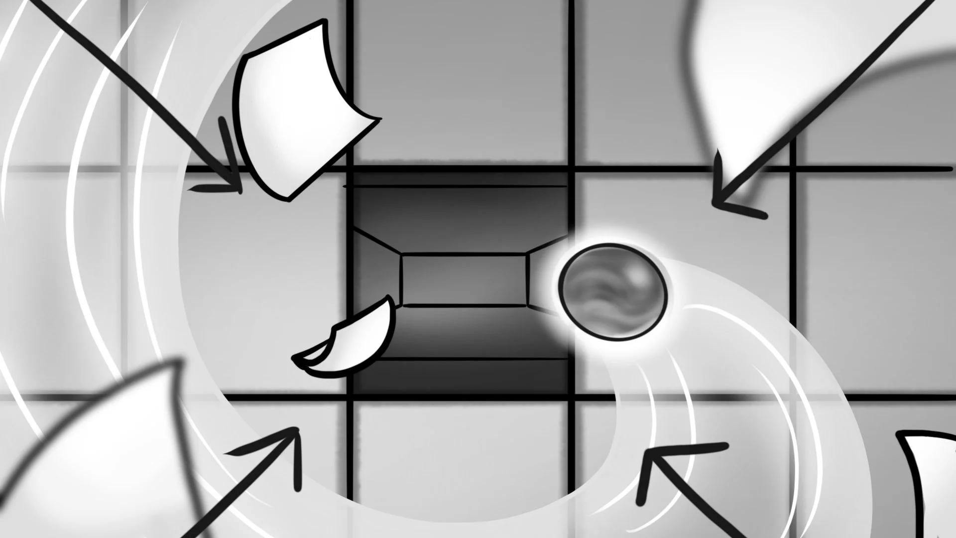
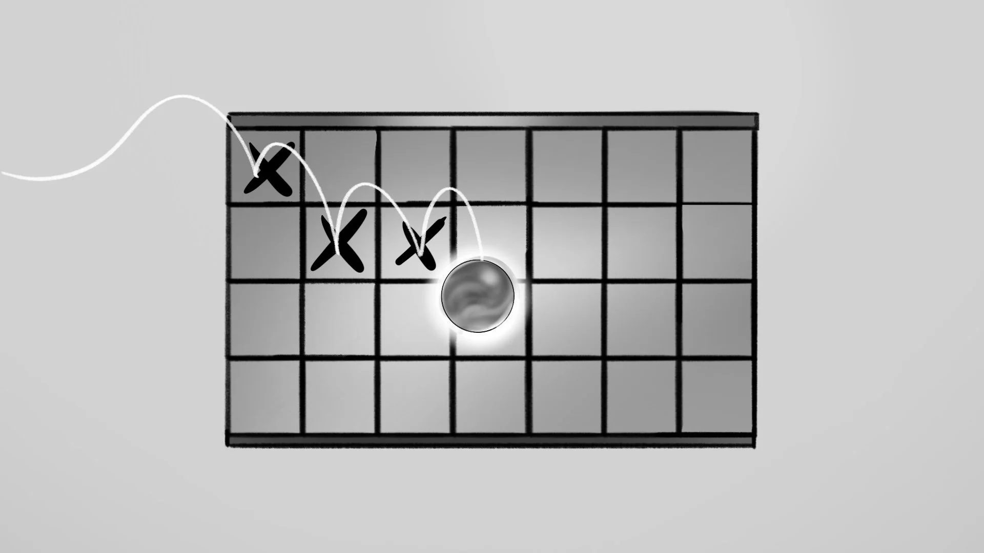
Storyboard snippets from episode one


AI is Making Our Volatile Planet More Predictable
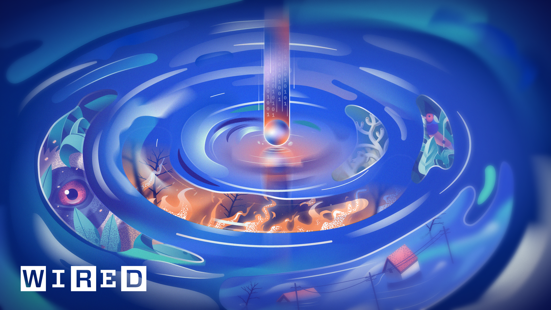
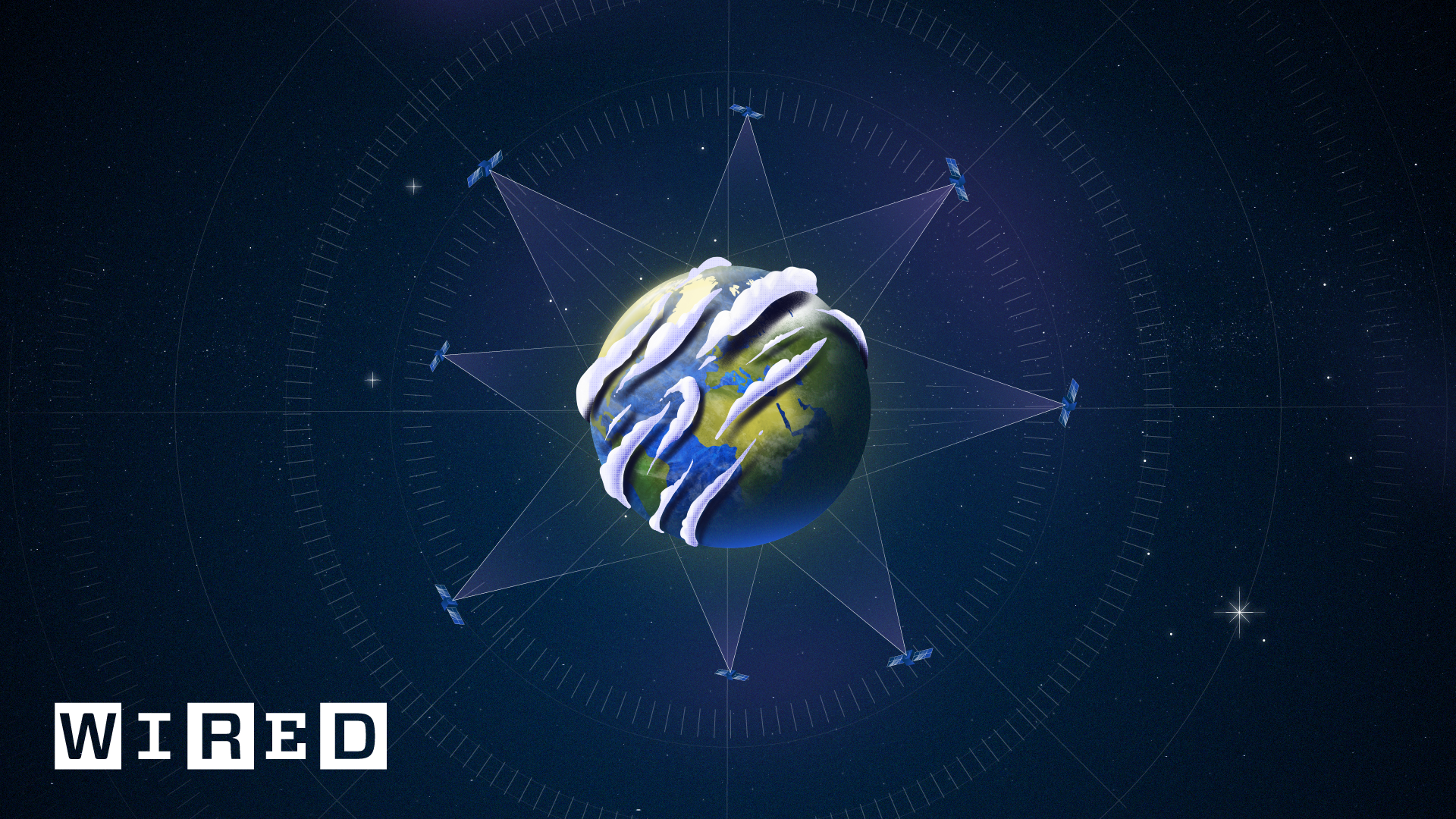
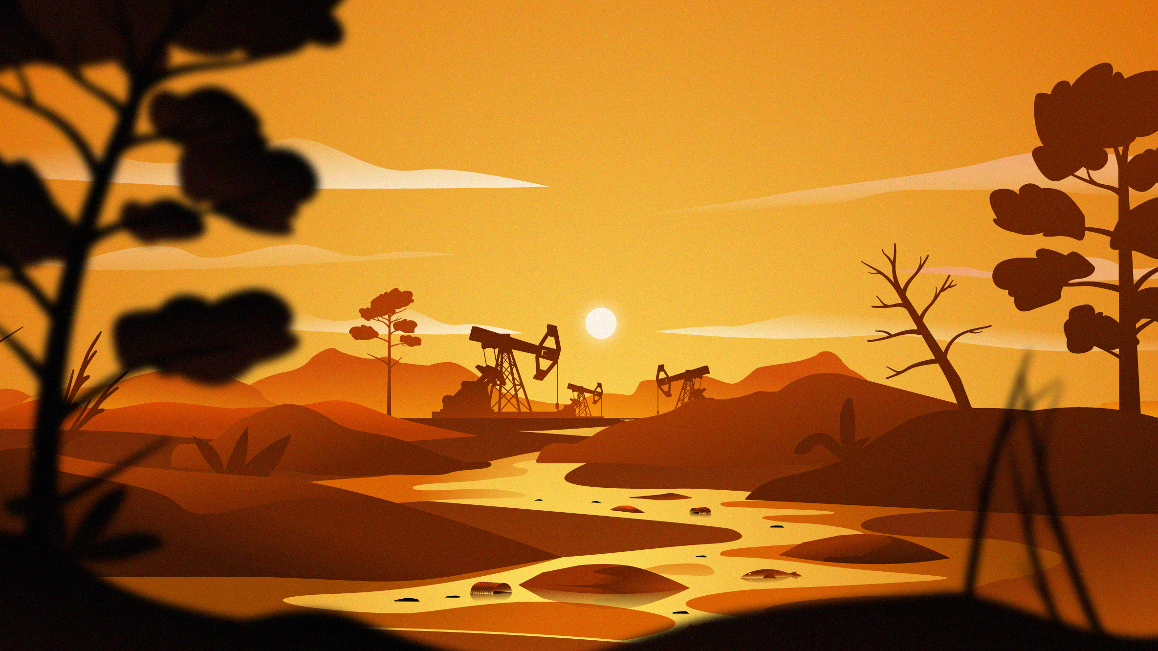
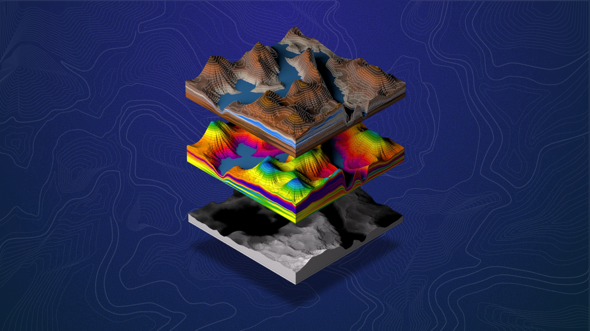
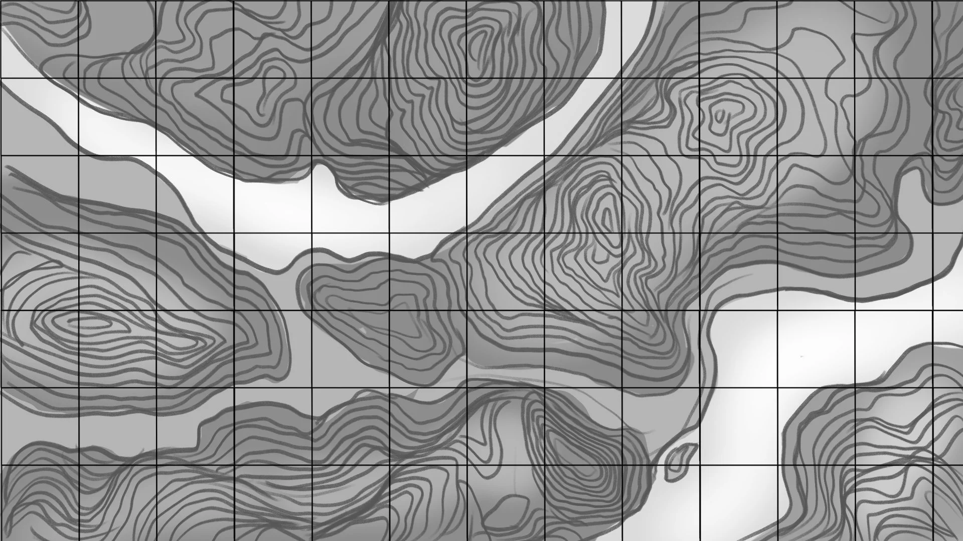
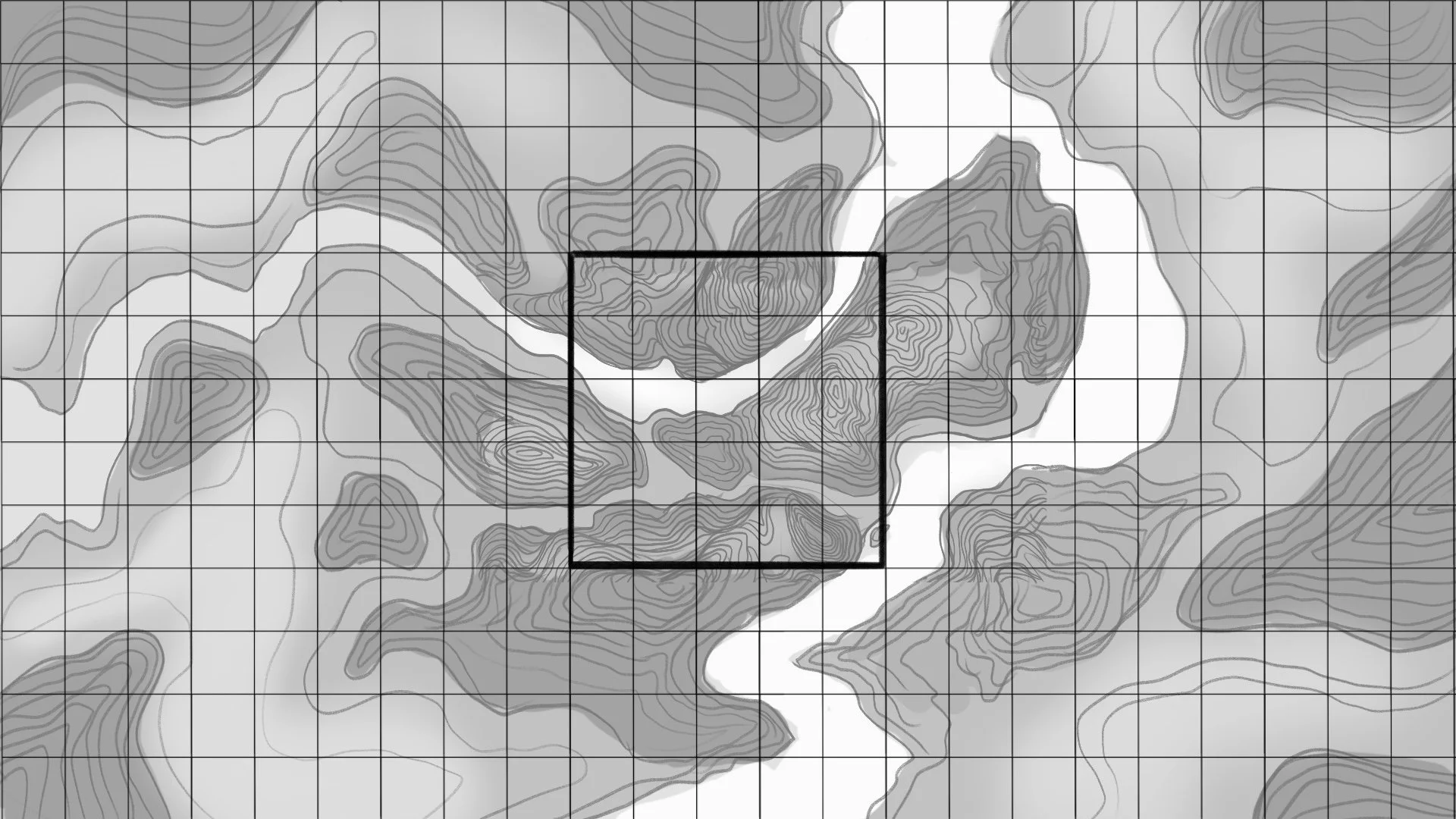
The next bit of work is all for the second episode, which focuses on how IBM’s AI, combined with NASA’s high-resolution data about our planet and its sun, helps us better understand the world we live in.
The same structure as before applies to this section, beginning with the articles and ending with the storyboard. As you see we have created a variety of styles in this project and that’s what made this a lot of fun to work on.
Styleframes
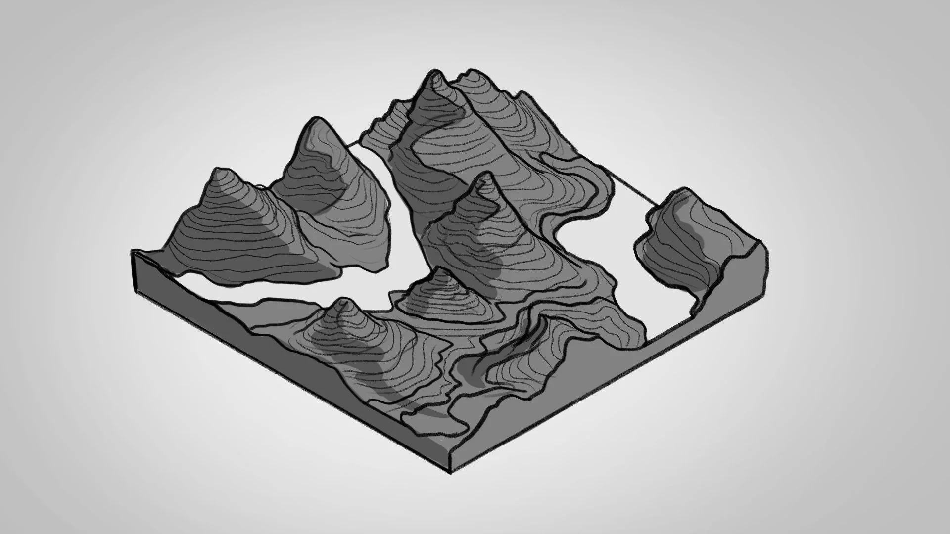
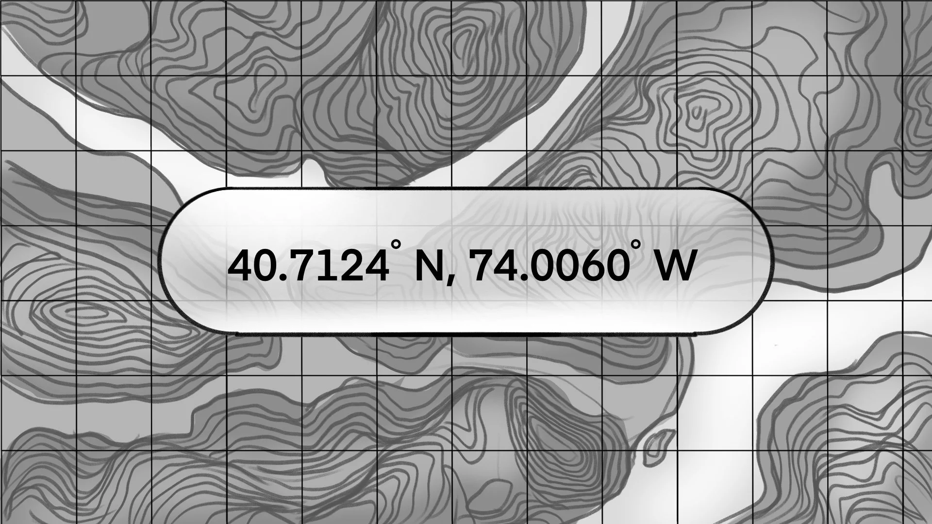
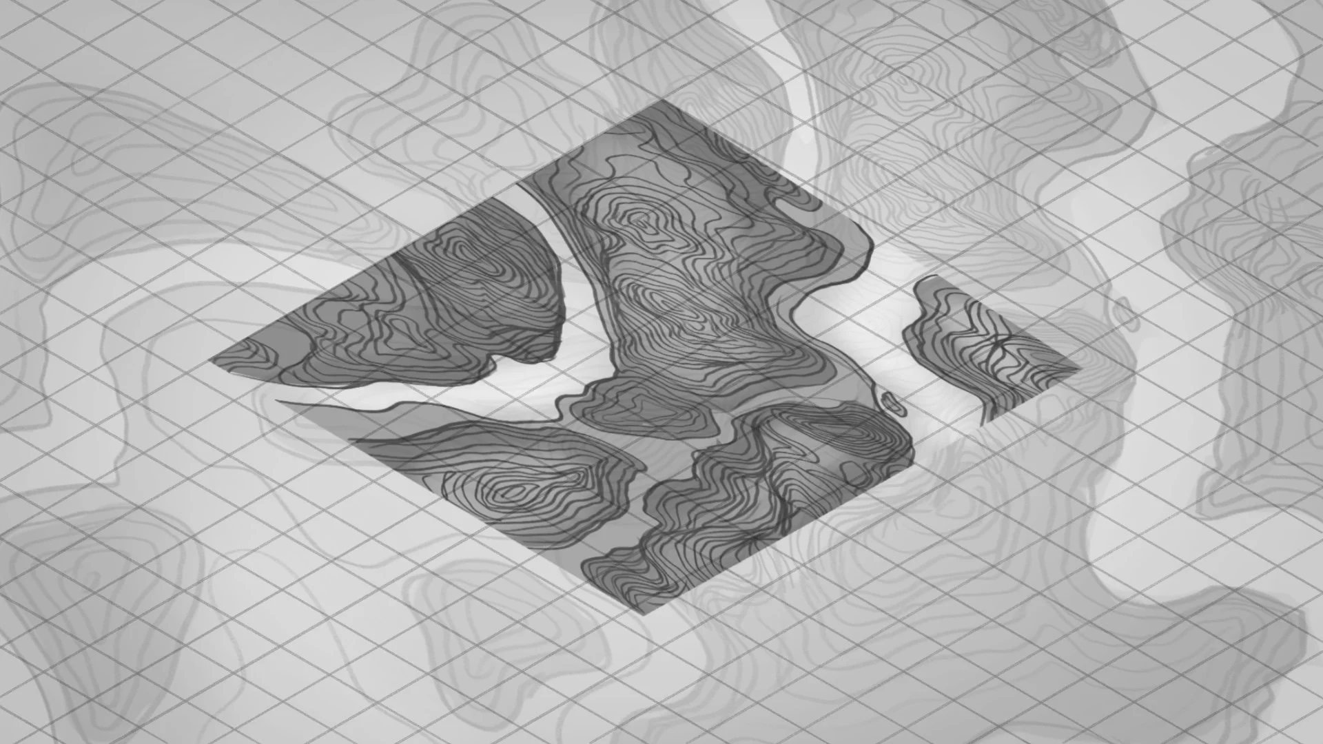
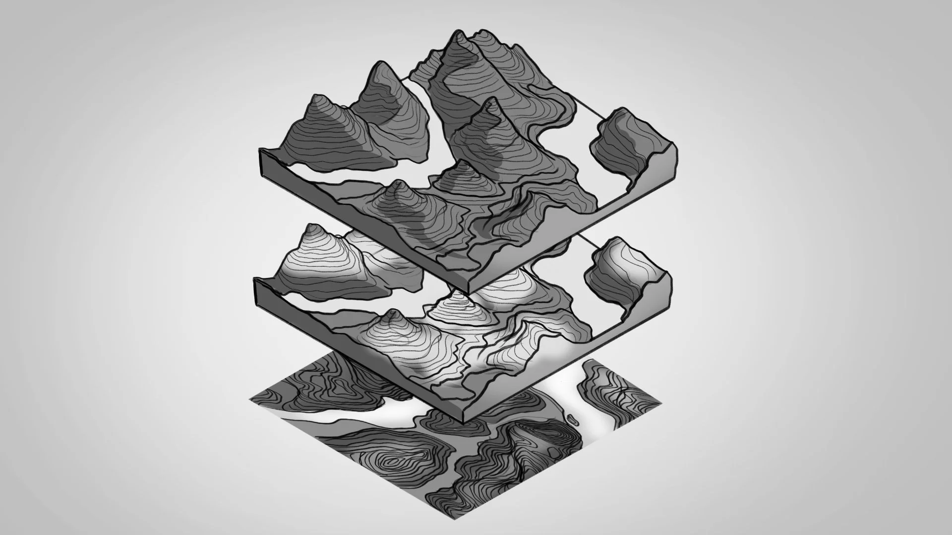
When we started designing the scenes for the episode about our planet, there were many different environments and ideas that needed to be communicated visually. The episode moves through landscapes, solar systems, topographical maps and other ambitious subjects, all of which had to be translated into a cohesive and visually striking animation style.
Conceptually, the world before AI is rigid, muted and uniform. As AI is introduced, the environment gradually shifts toward a more organic and expressive visual language. Structure becomes fluid, colour emerges, and the system feels more adaptive and human-centred. This contrast between the existing state and a possible future was essential in making the impact of AI tangible without relying on literal metaphors.
The visual style continued to evolve throughout the process. Some early styleframes differ from the final output, reflecting how the direction shifted during the proces. I chose to include both the initial explorations and the final result to show not only where the project landed, but how the visual thinking developed along the way.
Beyond making it visually engaging, the scenes also needed to help explain the AI system developed by IBM. This led to several adjustments throughout the process, as the visuals evolved to better support the story and align with the client’s needs.
Storyboard snippets from episode one
Credits
Creative Director
Director
Motion Designer
3D Animator
Animator
The AI Effect
Later will take care of itself. It always does.